The Seattle.gov website includes a number of “topic pages” that aggregate and surface content from various locations throughout the website in an effort to help our visitors find information quickly and easily. Assistance and Discounts is the latest topic page created in the human-centered navigation of the website. Content existed in various locations and iterations over the last several years without a standard layout.
It’s important to provide a trusted experience, especially with a vulnerable population. This information is part of the Seattle.gov public website, its authenticity validated with a .gov URL, and is in a design consistent with other webpages.
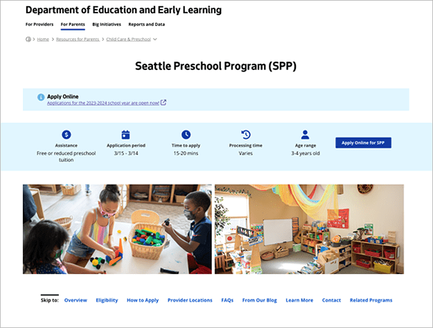
This project was a reimagining of how to display information about government benefits in a clear and consistent manner, using plain language. The Assistance and Discounts page surfaces content about programs and services across the 7,000 pages of the website, plus additional programs from external sources. City programs were also moved into a specialized template that carries over the eligibility filter from the topic page.
Assistance and Discounts was the result of an extensive design and development process beginning with subject matter experts and then iteratively tested with users for refining usability. Using this project as an example will help illustrate how we approach our work as a cross-functional digital services team.
Research and Design
“The human-centered process that was woven throughout this project exemplifies the importance and benefit for everyone.” – Michelle Ringgold, User Experience Program Lead
Challenge
Navigating City benefits and assistance programs online has been a challenging experience. Information was scattered across multiple websites, and each program’s webpage offered a different experience. Recognizing this issue, we decided to tackle this challenge by employing human-centered design principles. Our goal was to create an intuitive and user-friendly digital space for everyone, especially vulnerable communities, to navigate and discover City benefits and assistance programs.
Collaborating Across City Departments
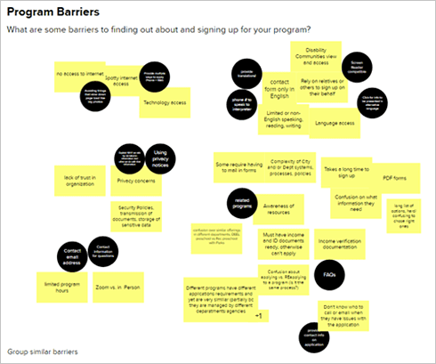
Our first step was to collaborate with every department that provides assistance- or discount-related programs. By engaging with these stakeholders, we gained valuable insights into their audience’s needs, challenges, and preferences.
Iterative Design and Refinement
We conducted feedback sessions and usability testing with departments, community partners, and target audiences to refine our design based on their input.
We remain committed to iterative refinement. Our team has implemented analytics tracking to identify improvement opportunities. One item we’re monitoring closely is the use of filters. Our goal is to leverage this data to prioritize filters so that heavily used filters consistently appear on the page.
Prioritizing Program Content
We worked closely with departments to prioritize program content. What information was most critical for users? What questions did they frequently ask? This collaborative effort helped us identify key elements for the newly designed program page template.
Usability Testing
To validate our design, we conducted multiple rounds of usability testing. We tested with immigrants, low-income individuals, families with young children, young and older adults, and social workers. One round of testing even led us to iterate further on the program page template.
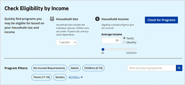
During usability testing, we discovered that users had difficulty determining their eligibility. Inspired by this feedback, we designed a new feature that allows people to quickly check if their income qualifies. One user testing participant, who identified as low-income, shared their thoughts: “I like how there’s a lot of information on the page, but it’s not an overload of words, which makes it easy to understand.”

Accessibility-First Development
“Too often accessibility features are ‘tacked on’ at the end of the development cycle. Instead of considering accessibility separately, it was integrated at the start of the project into each phase of implementation. The result is an Inclusive Solution—one that works for everyone, including those with disabilities.” – Jeff Pierce, Senior Web Developer
As our Development Team assessed the designs, they focused on four key aspects of the development plan.
Agility
In collaboration with our User Experience Team, they set up an iterative build process that allowed for user testing and feedback to be quickly incorporated into the product.
Supportability
They built the solution with the content editors in mind. Considering their experience is important, as we have a decentralized content management model for Seattle.gov. The program detail template allows the program owners to edit key information about their programs without technical intervention.
Scalability
The filter feature is flexible enough to support a wide array of programs, including programs that are not based on household number and/or income requirements. It can also include county- and state- managed programs and resources.
Inclusivity
An “accessibility first” approach simplified the interactive features for all users. The Development Team established a solid foundation of digital accessibility from the beginning. Adopting this accessibility-first mindset ensures that the information is available and usable by all website visitors, as is required by law. One method to do this was integrating an accessibility checklist and accessibility test plan at the planning stage before beginning implementation. Further, applying Progressive Enhancement development methodology ensures that content is delivered to users in a way that adapts to situations, such as their internet bandwidth or device characteristics.

Build and Test
“This build of this project was immensely impactful because it involved eight departments, 14 individual programs, 270 content and feature updates prior to launch, and 320-page components in our content management system… all to enhance pages that are viewed over 10,000 times each month.” – Christian Clemmensen, Senior Product Manager
Our Production Team worked closely with our User Experience Team to build both the Citywide Assistance and Discounts topic page and fourteen individual program pages representing eight City departments. This work in our content management system delicately balanced the creation of hundreds of page components to preserve the shared ownership of the pages. Some portions of the content are built to be common between all programs, while others exist in the workflow of each department’s section of Seattle.gov.
During the quality assurance process of the initial build-out, Production, in conjunction with our Development team, addressed 198 pre-launch enhancements to content and functionality. At the time of launch, these teams made an additional 72 enhancements to ensure that all formatting and content was prepared for hand-off to the departments program managers to begin their own editing. This work included bringing all of these pages to 100% accessibility compliance using our automated testing software and ensuring that the launched content displays properly on all devices.
Content editors across the eight departments have access to update the new program page templates. Portions of those program pages and the entirety of the new Citywide Assistance and Discounts topic page require us to make content edits in order to preserve the special filtering technology utilized on these pages.

Communicate and Train
In addition to working with department program managers to move content into the new template in plain language, we continued communicating about launch timing. As we entered 2024, income requirements would begin to change, and we worked with program managers to gather the updated data to complete the eligibility filter. We trained about 20 content editors across City departments in how to make updates to the new program page templates and provided help documentation about these exciting new additions to the website.
Conclusion
The new Assistance and Discounts page provides a user-friendly interface that empowers people to easily access and explore all available City benefits and assistance programs and provides them with a consistent experience when navigating City programs. Through thoughtful design, we’ve created a digital space that prioritizes the needs of those seeking assistance. It is not completely done. Our teams will continue to finalize additional enhancements. We will continue to evaluate, iterate, and improve to create more accessible and impactful services for our communities.
It’s satisfying to see the final outcome of this work, and we’re proud of what we’ve presented for the residents of Seattle. The thoughtful planning and execution described here is how we approach each new or enhanced feature. Information about the City of Seattle’s requirements and guidelines for digital products is available at https://seattle.gov/digital.

This initiative recently earned a Project Experience Award from the Center for Digital Government! These awards are for digital solutions that make it easier for citizens to do business with their government.
Michal Perlstein leads the City of Seattle’s Digital Engagement Team. She is passionate about the intersection of technology and social impact and has spent the past 15 years working in the public sector.
The City of Seattle’s Digital Engagement team designs, develops, and manages the digital experiences and products that enable City departments to communicate effectively with the public. The expertise among the team members brings increased consistency, usability, and accessibility to the City’s digital communications. The Digital Engagement Team is part of the Seattle Information Department (Seattle IT). Seattle IT is a trusted partner that provides secure, reliable, and compliant technologies, enabling the City to deliver equitable and responsive services to the public.