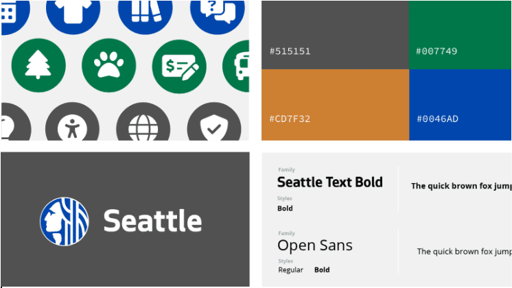
The City of Seattle’s Digital Engagement User Experience (UX) team maintains the Digital Style Guide for City employees who create digital content, such as web pages, blog posts, social media, and more. This resource turned five years old this year and my, how it’s grown! Over its lifetime, UX leads have added more topics, more guidance, more webpage components, and more requirements as we discovered the importance and convenience of this Digital Style Guide.
Just like technology changes and evolves, so does how we communicate with Seattle residents through our digital platforms. With these changes to technology came changes to how we build and evolve our resources so that employees can be successful with digital communications. Here’s a peek behind the curtain on how we take a human-centered process approach to make these updates.
An Essential Resource
As a team, we articulated our user experience goals for the style guide. We hope that it:
- enables users to create great digital content,
- promotes understanding of digital patterns and concepts,
- shares the requirements for all public-facing web applications, websites, and mobile apps, and
- ensures consistency in digital communications for the City.
We also want our style guide to:
- become an indispensable resource that employees return to time and again, and
- be valued and shared widely among our users.
Human-Centered Design Provides the Roadmap
To approach the project, we defined our target audience groups both inside and outside our organization.
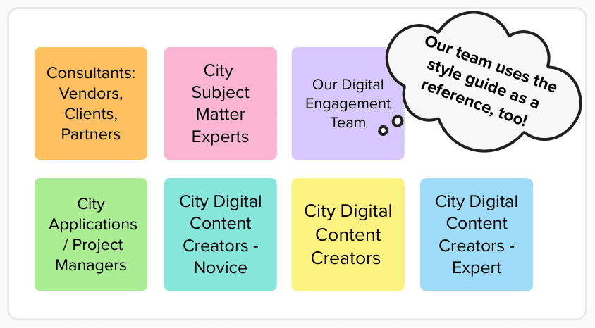
We brainstormed audiences for the style guide and revised the final list to include outside consultants (vendors, clients, and partners) and a range of City stakeholders: subject matter experts, project managers, digital content creators (with experience ranging from novice to expert), and our Digital Engagement Team.
Defining the Problem
We spent several meetings recalling experiences at the City that revealed trouble spots with using the style guide. Next, we explored each of those pain points. We questioned the Why and How behind them using the framework shown below, emerging with a deeper understanding of the issues and possible solutions.
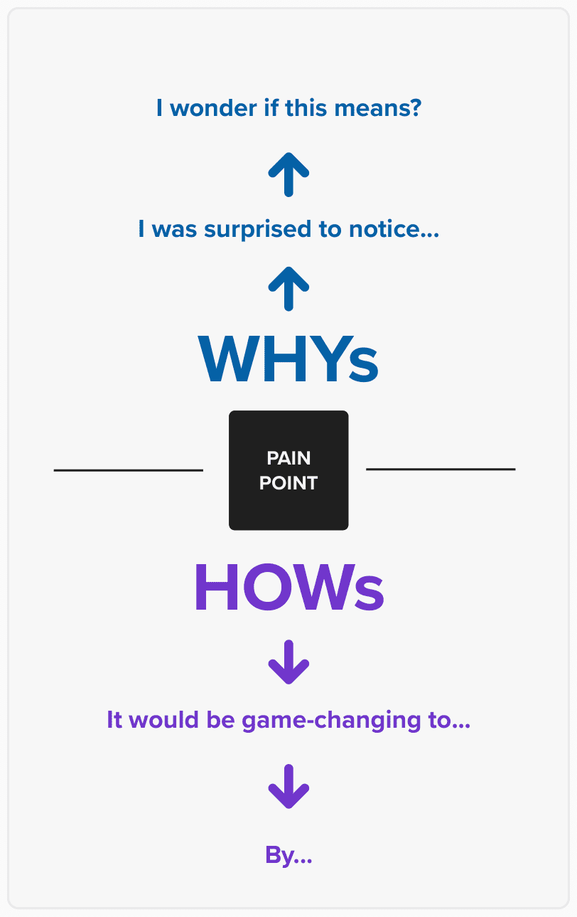
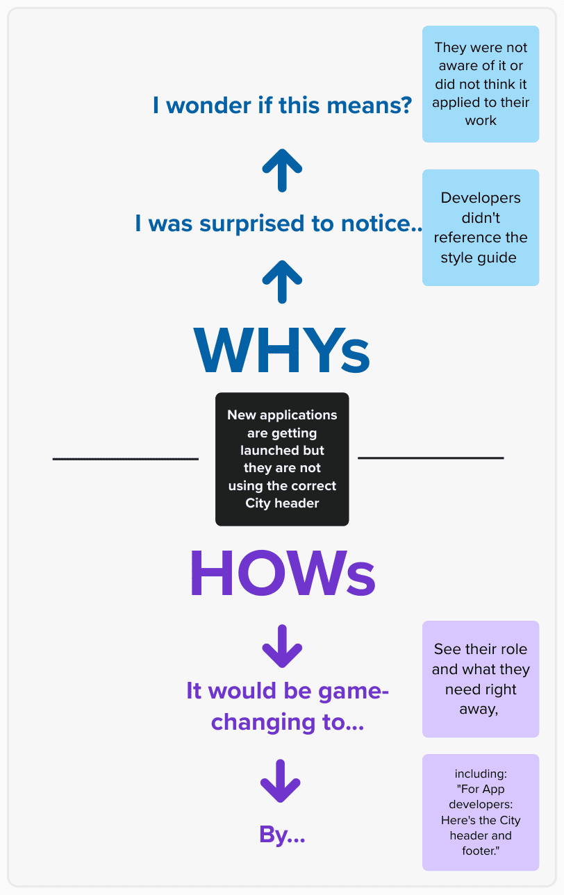
Try the How & Why exercise: State the pain point. Next explore WHY it is happening by completing the statements, “I was surprised to notice…”; “I wonder if this means…?” Then explore the HOW by completing two more statements: “It would be game-changing to…”; “By… [doing/creating/communicating x]” Do this for each pain point and then evaluate. Are the same underlying issues repeated? Does one solution come up multiple times?
We chose three issues to tackle:
- Our experiences suggested that users may not value the style guide or know it is for them–even if they’re aware of the resource.
How might we engage users at the moment they land on the page?
- We found ourselves unable to remember where things were located amongst the long, unordered navigation list.
How might we improve the navigation?
- The style guide is one tool in a toolkit that includes other internal and external resources.
How might we clearly connect to these other resources within the style guide?
Collecting Knowledge, Comparing Systems
We researched other style guides and design systems in the public and private sectors. Comparisons gave us a lot to talk about as a team:
- What categories are common to design systems now?
- What are they called?
- What do they contain, and how is that communicated?
- What do different landing pages look like and say?
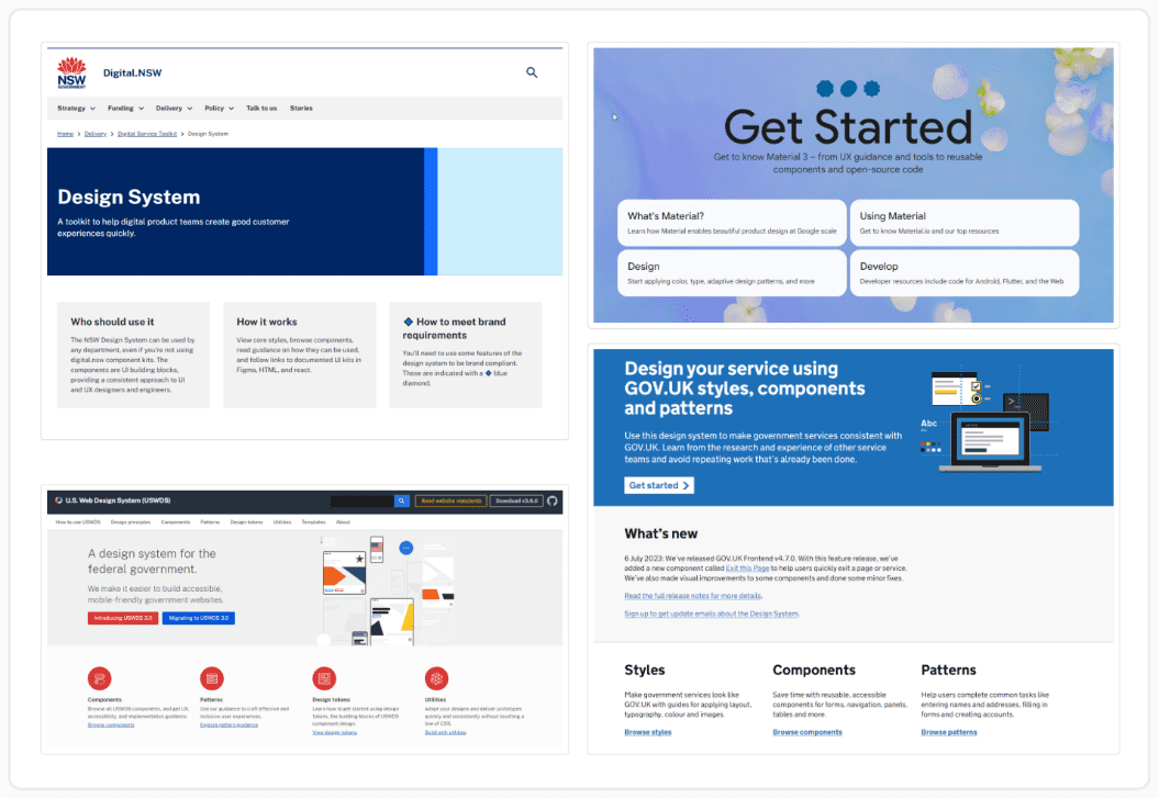
We looked at many examples from Design Systems Repo | A Collection of Design System Resources as well as those we reference regularly ourselves: Material Design, US Web Design System, and GOV.uk Design System.
Sketching and Ideation
Our style guide is built on a feature of our prototyping software that allows us to link our prototypes directly. Retaining this infrastructure and the general content of the style guide were our constraints.
We sketched how to organize the navigation pane and explored designs for a landing page that welcomes users and builds their confidence in navigating the resource.
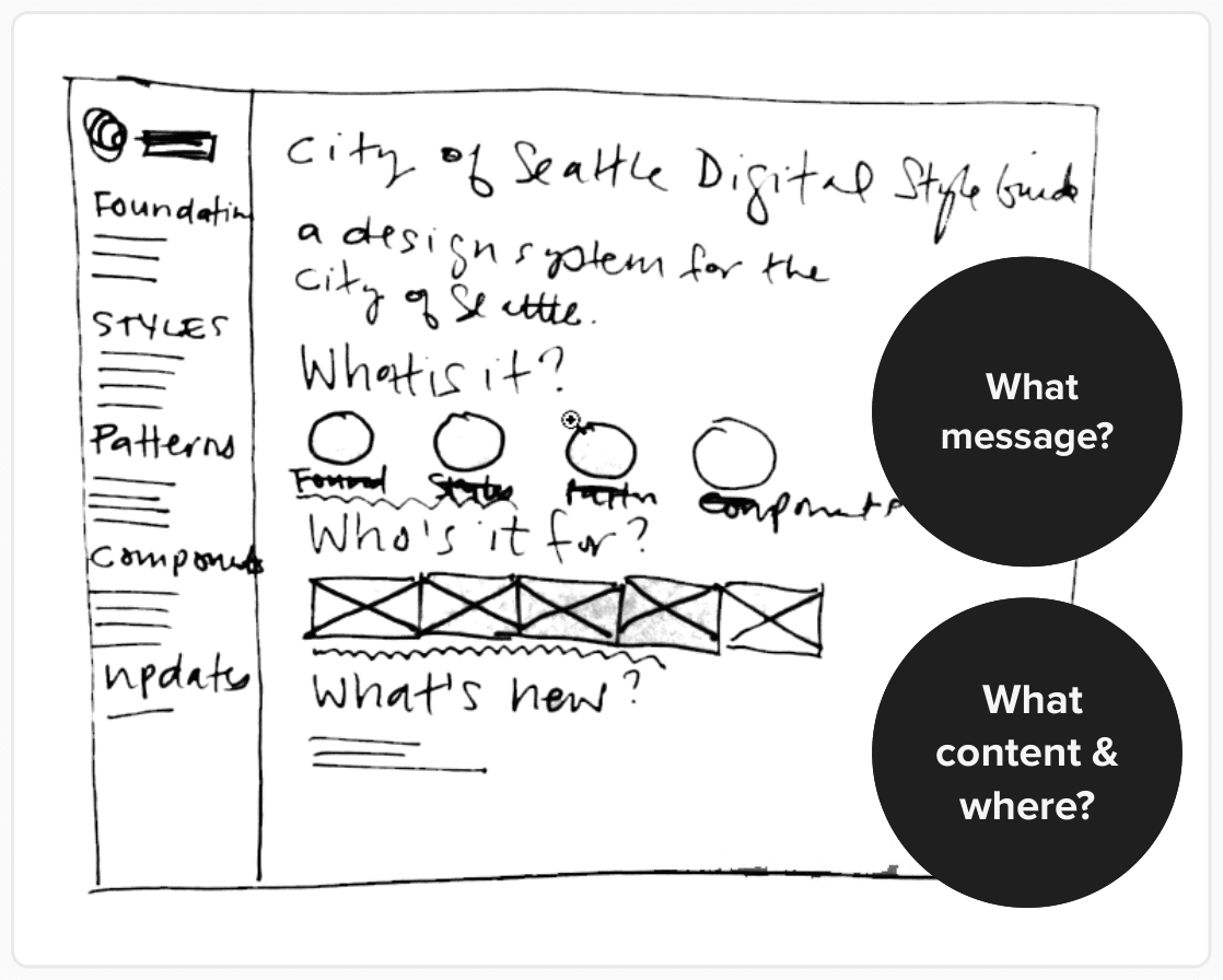
The prompts, “What message” and “What content and where?” helped us generate options. Combining aspects from multiple sketches, we iterated on three draft concepts for the landing page.
Adding Structure, Improving Navigation
In addition to a new overall landing page for the style guide, we created sub-sections within the navigation—Foundations, Styles, Web Patterns, Seattle.gov (a section dedicated to the web components that our CMS users need), and Style Guide Updates. Each sub-section has its own landing page that describes:
- What is in the section,
- What you can do here,
- Who this section is for, and
- Related resources for City employees.
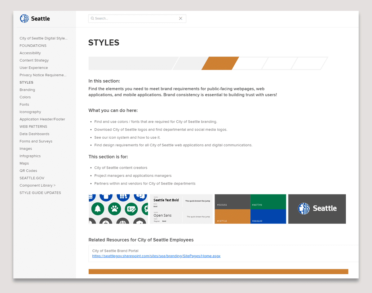
One of the new sub-section landing pages, STYLES. This section contains elements of the brand identity.
Testing Page Names in the Navigation Pane
Once our page designs were set and we were happy with the navigation pane, we did a test with 45 testers using the terms and subcategories we had decided upon. Each of the audience types was represented in the participant group. As a result of the study, we reworded or re-arranged some navigation items to the final list.
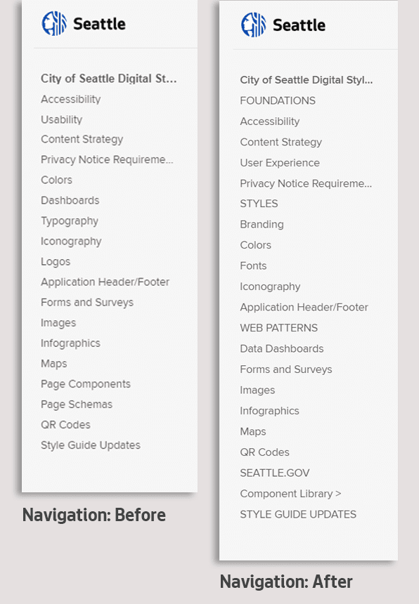
The navigation pane before our project was an undifferentiated list. Constraints of the product limit how much visual variation is possible in navigation pane items, but we were able to achieve some distinction between categories and sub-categories using type styling.
Our Digital Style Guide v2
The final result improves the user experience of the Digital Style Guide with features including:
- A new landing page that describes what this is and who it is for,
- Content sections in the left navigation area, rather than just a running list of topics,
- A portal page for each section that describes what can be found there and
- More consistency and human-centered content throughout.
- A new short URL: https://StyleGuide.seattle.gov
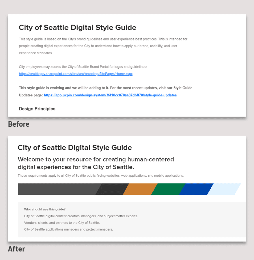
The old landing page launched directly into content and design principles without welcoming users or describing what it contains. The new landing page starts with a welcome statement and includes elements of City branding.
Lessons Learned
On a small, busy team, it is easy to keep our focus on the steady stream of projects that we prioritize to improve user experiences with our digital City government. We discovered that the Style Guide had become a place full of human-centered content that was not very human-centered in its structure or organization! Taking time to focus on this core resource resulted in a better tool to reinforce requirements, make our communications more consistent, and educate City staff. All of this leads to better digital design outcomes for the public. We’d like to embark on a summative evaluation of the project to create a baseline for future improvements, and we also plan to promote our Digital Style Guide more regularly.
Visit the City of Seattle Digital Style Guide.
The City of Seattle’s Digital Engagement team designs, develops, and manages the digital experiences and products that enable City departments to communicate effectively with the public. The expertise among the team members brings increased consistency, usability, and accessibility to the City’s digital communications. The Digital Engagement Team is part of the Seattle Information Department (Seattle IT). Seattle IT is a trusted partner that provides secure, reliable, and compliant technologies, enabling the City to deliver equitable and responsive services to the public.
Julie Sayigh is a User Experience Designer at the City of Seattle with a background in exhibit design and planning and a MS in Human-Centered Design from the University of Washington. T