
I’ve been thinking about the areas of overlap between our design principles and web content policies. While our digital services team sees the connections, they may not be obvious to the staff members and vendors creating content for the public. The impact is simple: good content strategy makes a government digital experience easy and inclusive. And we’re hopeful that the new federal regulations for digital accessibility will drive a renewed look at consistent and intentional content creation practices.
Since much of our content strategy guidance is nested inside digital policies and our design system, I’d like to highlight our best plays here. They center around three themes:
Inclusivity
Inclusivity stems from curiosity about and empathy with our users, understanding and then internalizing their behaviors, pain points, and requests. We prioritize our users’ needs above visual aesthetics when making trade-offs. It impacts the type of content we select (e.g., text, images, dashboards), how we design the layout of the page, and the words we choose to convey information. Everyone benefits from a focus on those with the greatest needs, often in ways that aren’t recognized until after a special consideration is implemented.
Information Architecture
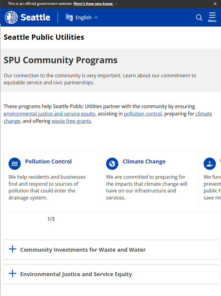
In our menus, we follow users’ expectations, not our internally-facing organizational structure. This strategy challenges us to move information from department or program silos into navigational themes like topic and audience pages, supporting the users in accomplishing their tasks. We develop reusable components to create recognizable and consistent ways to structure information across our website. Choices for prominent navigation links and their labels are equally important.
Taxonomy and Plain Language
We aim to make all writing, from labels to headers to body text, clear and useful. The language supports our Citywide Voice and Tone Guide. Why make information complicated when we can easily find common ground and meet our users where they are? Exclusionary language like industry jargon and undefined organizational acronyms can lead to miscommunication. Politically-named programs instead of simpler human-centered names don’t have the impact expected, and may even be a blocker to understanding, security, trust, and translation.
Below are examples of these themes in practice on Seattle.gov:
Standard page structure and text formatting gives a screen reader the rules for flow of information and also helps with visual consistency for that reading flow.
Even small formatting cues can derail comprehension and make it difficult for the user to complete their task.


Digestible chunks of information reduce cognitive load.
This is advantageous for a user with low literacy, a language barrier, a limited attention span, or someone trying to process complex information while reading on a smartphone.

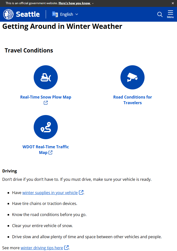
Leveraging options for creating a call-to-action, such as opening separate applications in a new tab, provides clear next steps.
When embedding separate applications in an i-frame, the intention is likely to provide convenience and fewer clicks for the end user. In practice, however, it’s often harder for the user to interact with the application with challenges like extra scroll bars or a limited visible area. Maintaining simplicity provides three benefits:
- The user has agency, deciding whether they want to dive into an interactive map or lengthy form. This impacts speed of page loading and the data download capacity – both performance and equity.
- The user can achieve the full experience of the linked web application. It is branded as a clearly distinct product and responsive to screen size, while still providing access to supporting information like descriptions and legends.
- Analytics can be tracked more precisely within the application, using the referral source from the web page.

Metadata is often undervalued.
A content management system may complete some metadata fields automatically during the publishing process. Other fields require manual input or review, like page language, alt text for images, and the page descriptions that are captured by search engines. While metadata is generally hidden from the visual experience, it’s essential for both assistive technology and artificial intelligence. We need to design and build for both user experience and agent experience.
This is certainly not an exhaustive list of tasks involved in the creation of a usable website, and these simple tips can go a long way to ensuring that web content is cohesive and is accessible to all.